BrandingMental HealthWebsite
Higher Purpose Recovery
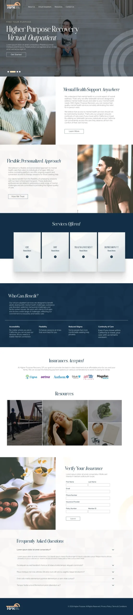
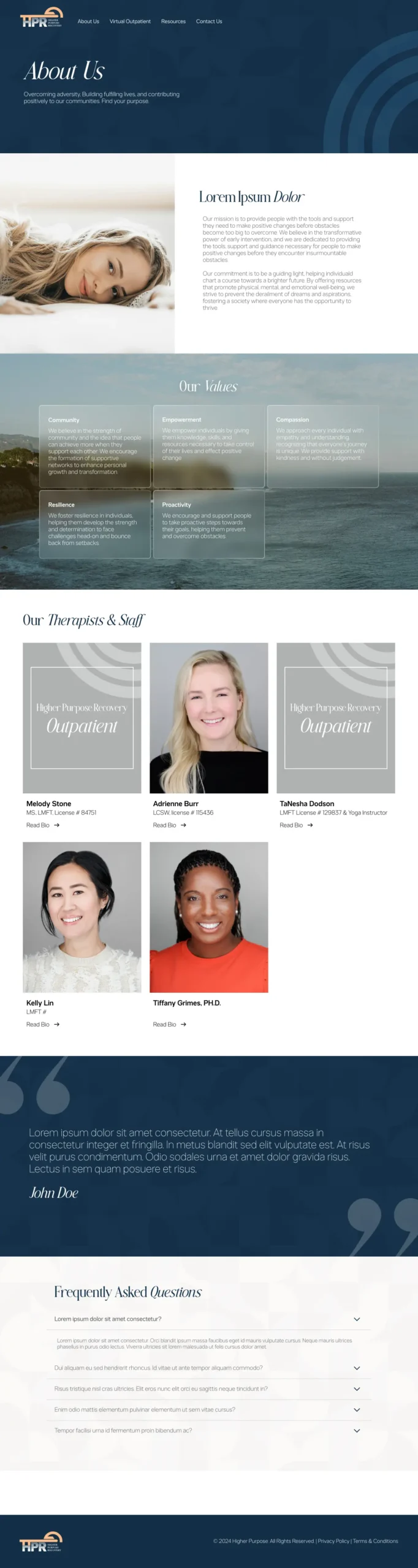
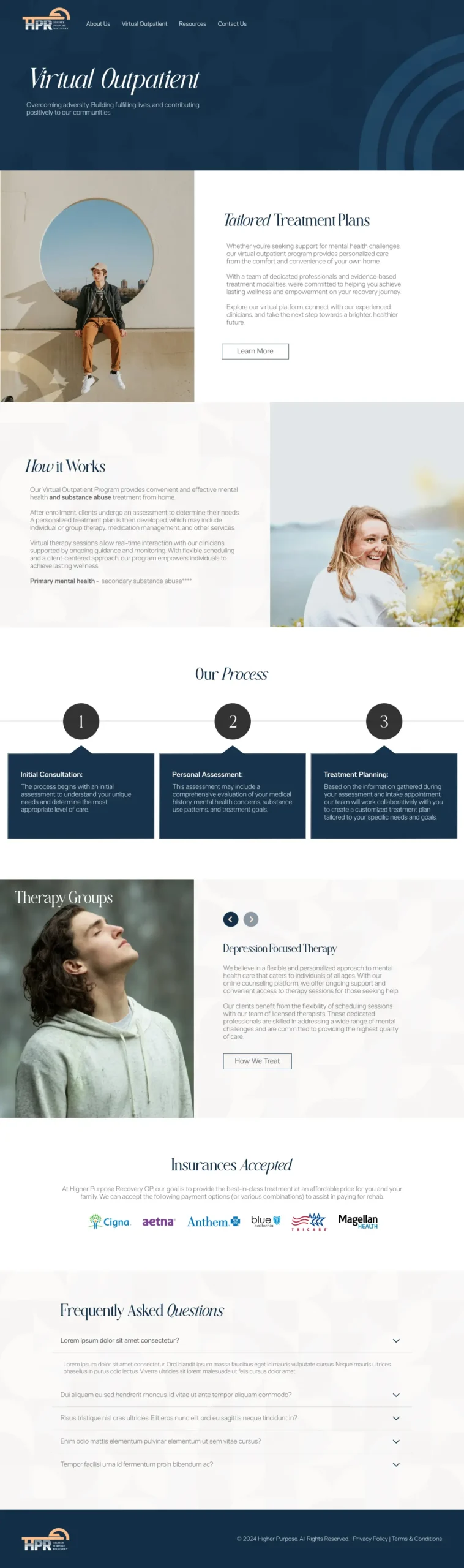
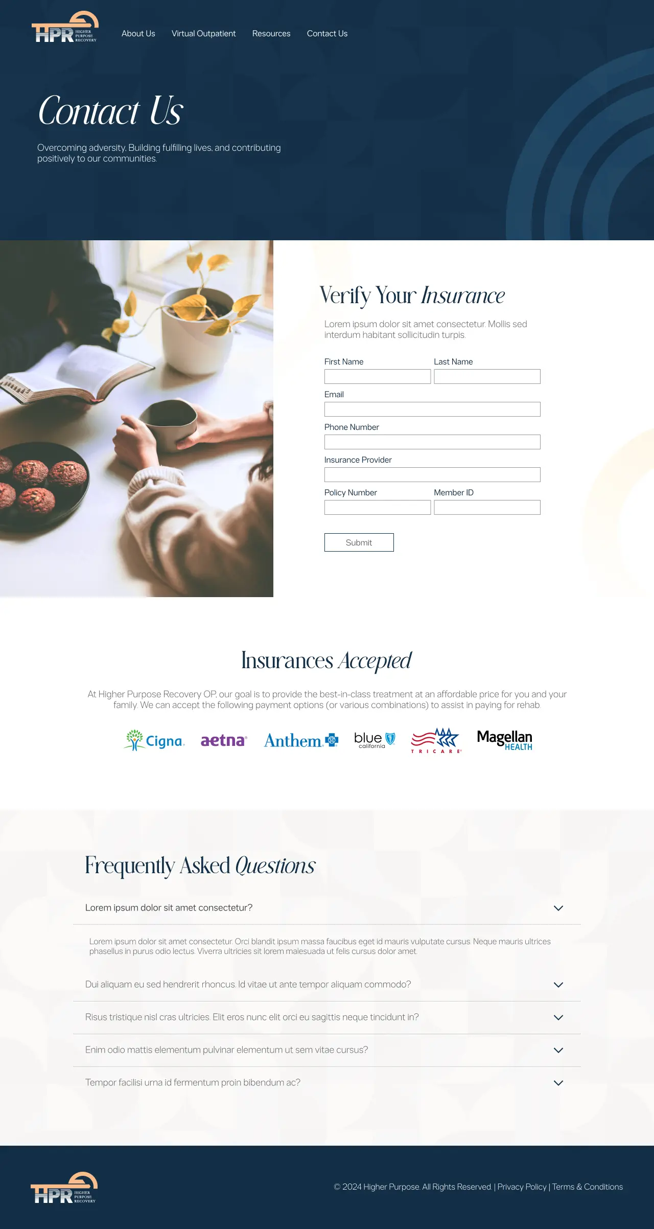
Higher Purpose Recovery originally launched as a men’s sober living program, but when they expanded to offer virtual outpatient services for all genders, they needed a new 5-page website. The client already had branding in place for their original program and wanted this new site to feel visually connected, but more inclusive and less overtly masculine.
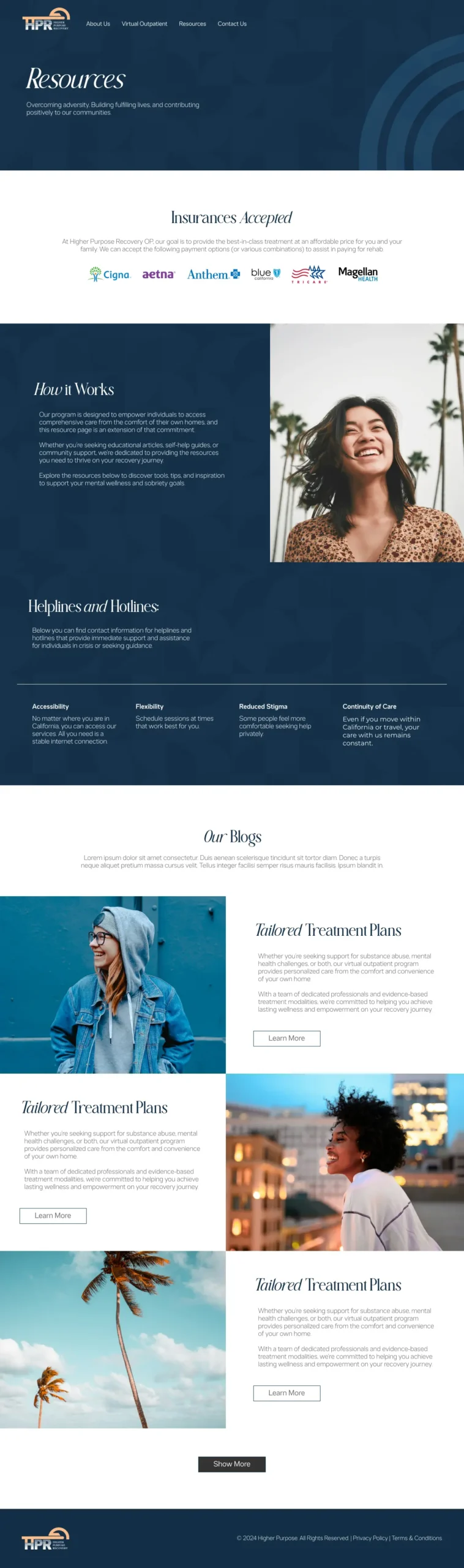
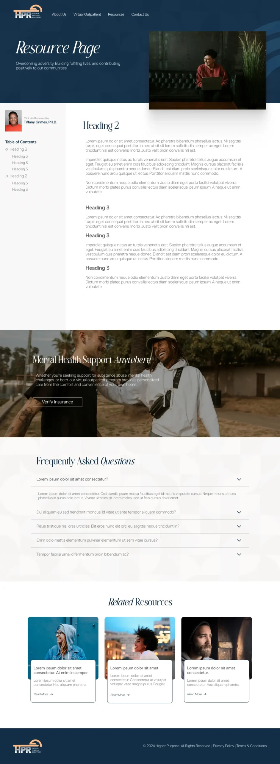
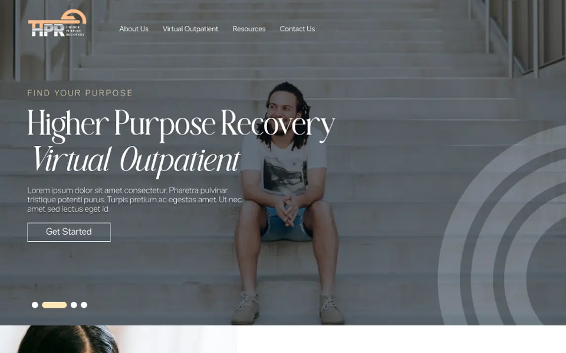
The goal was to create something calming, clean, and welcoming to anyone exploring recovery—regardless of gender identity. We worked within their existing visual framework, making intentional changes to soften the look while modernizing the layout and overall user experience.
The core challenge was balancing continuity with inclusivity. The original branding was built around a male-only audience, so everything from the fonts to the color palette felt more rugged and bold. For the virtual outpatient program, we needed to pivot to something more serene and universally welcoming, without completely abandoning the visual identity of the parent brand. We also wanted to create a clear, distraction-free experience for users, many of whom might be navigating the site during a difficult or transitional time in their life.
We started by simplifying the design elements—softening the color tones, changing the typography to something more modern and approachable, and introducing large, calming imagery that helped set the tone without overwhelming the content. The new site keeps the structure of the original brand while introducing more open space, gentle visuals, and intuitive navigation. Every design decision was made with clarity and accessibility in mind, making it easy for users to find the support they need quickly and without friction. The end result is a site that feels like a natural extension of the brand—just with a broader, more inclusive reach.