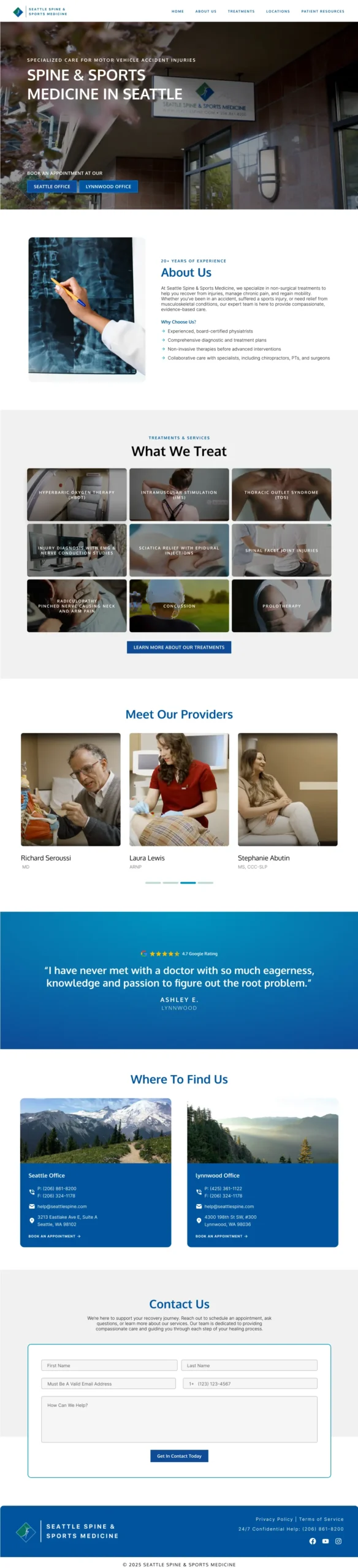
Seattle Spine & Sports Medicine approached us to redesign their website with a focus on improving usability and giving their brand a much-needed visual refresh. They specialize in non-surgical treatment options for everything from sports injuries and chronic pain to post-accident recovery. The original site was outdated, cluttered, and a little overwhelming for patients just trying to find the care they need.
Our goal was to create a streamlined 5-page site that felt calm, modern, and easy to navigate. We began with a full site audit to determine which content could be condensed or removed altogether, and then built a design plan that worked within the client’s budget while still delivering a high-quality, scalable solution.
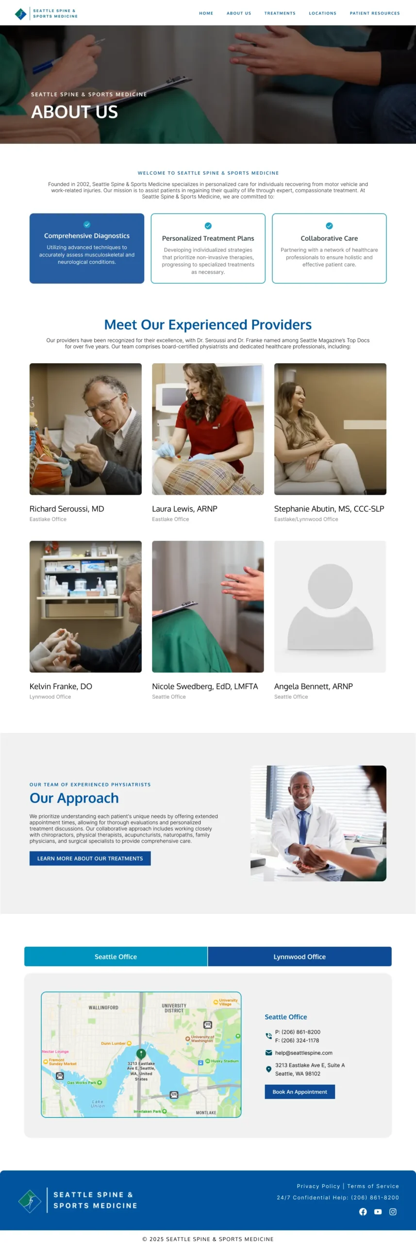
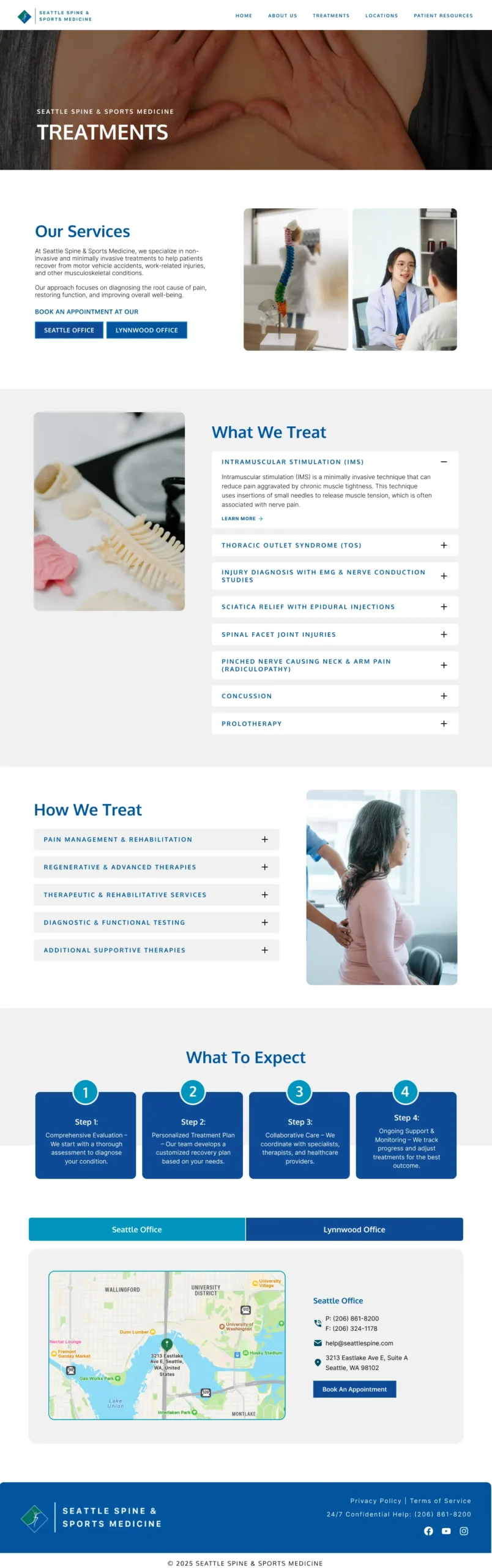
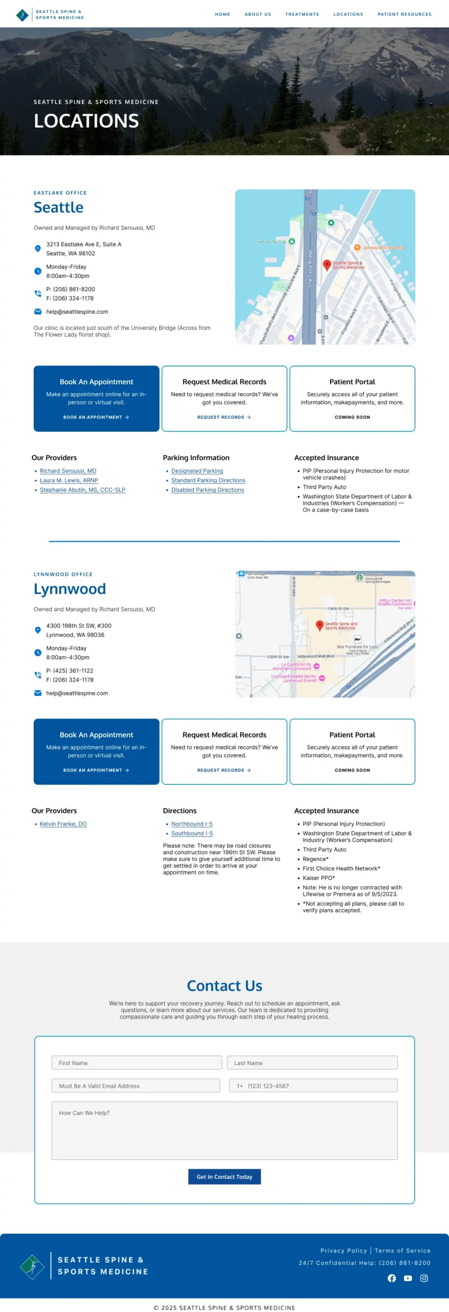
The biggest challenge was balancing functionality with clarity. The original site had pages with a lot of clutter and the opposite issue of lacking important information. This made it hard for users to quickly get the information they needed. We also had to be mindful of the budget, which meant getting creative with how we structured both the content and the design process. The client wanted the new site to look fresh and clean, but also to be something that her team could easily update on their own, without needing to bring in a developer every time a new service or blog post was added.
We started with two home page mockups that explored different approaches to layout and content hierarchy. The client liked different elements from each, so we worked together to create a final layout that combined the best of both worlds. The result is a modern, intuitive website that still feels warm and approachable. We built reusable page templates with clear formatting and content blocks, so that even someone with little to no development experience could easily update or expand the site as needed. The final product is not just a pretty website—it’s a functional tool that supports both the business and the patients they care for.